Welcome to the third part of our Power BI series on Advanced Power BI Marker Conditional Formatting. In this post, we will delve into the creation of a DAX measure that allows for multi-level color formatting in Power BI scatter charts. If you missed the previous parts, you can catch up by reading Elevate Power BI Visuals with Disconnected Tables and Power BI Conditional Marker Sizing: Enhancing UX with DAX. Let’s get started!
I learned some of the things discussed in this blog post from Power BI Bootcamp: Zero to Mastery course. If You join the course I will earn a commission.
The Business Scenario for Power BI Marker Conditional Formatting

Imagine a large public sector institution with thousands, or even tens of thousands, of users. Each user has their own account and logs into a shared application used by multiple institutions.
Some Power BI visuals and data within this application are accessible to everyone, while others are restricted by security groups and filters.
In this scenario, we have been tasked with the following:
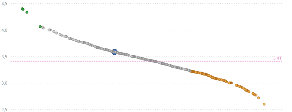
- We need to colour the markers based on the average calculations.
- If the institution is above the range then we need the color green.
- If below, orange.
- If in the middle of the range – default or grey.
Understanding the Measure for Power BI Marker Conditional Formatting

The measure Selection_Highlight we are creating has several components that work together to apply conditional formatting based on various criteria.
Selection_Highlight =
VAR SelectedID = LOOKUPVALUE('DimInstitution'[ID]; 'DimInstitution'[Institution name]; SELECTEDVALUE('DimInstitution'[Institution name]))
VAR ValueAVG = [Value]
VAR LowerLimit = [Lower limit]
VAR UpperLimit = [Higher limit]
VAR IsSelected = NOT ISBLANK(SelectedID) &&
    CALCULATE(
        COUNTROWS('FactTable');
        'FactTable'[ID] = SelectedID
    ) > 0
VAR RelevanceStatus =
    IF(
        ValueAVG < LowerLimit; "Below the limit";
        IF(
            ValueAVG > UpperLimit; "Over the limit";
            "Average"
        )
    )
RETURN
    IF(
        IsSelected;
        "Selected";
        "Not Selected - " & RelevanceStatus
    )
Breakdown of the Measure for Power BI Marker Conditional Formatting
SelectedID Calculation
VAR SelectedID = LOOKUPVALUE('DimInstitution'[ID]; 'DimInstitution'[Institution name]; SELECTEDVALUE('DimInstitution'[Institution name])) This variable retrieves the ID of the selected institution from the DimInstitution table. It uses the LOOKUPVALUE function to find the ID based on the institution name selected in the slicer.
Average Value Calculation
VAR ValueAVG = [Value] This variable stores the average value from the dataset.
Limits Definition
VAR LowerLimit = [Lower limit] VAR UpperLimit = [Higher limit] These variables define the lower and upper limits for comparison.
Remember, we need to define the upper and lower limits to use in our condition to colour the markers.
Dissecting the Measure for Power BI Marker Conditional Formatting Even Further
Selection Check
VAR IsSelected = NOT ISBLANK(SelectedID) && CALCULATE( COUNTROWS('FactTable'); 'FactTable'[ID] = SelectedID ) > 0 This variable checks if an institution is selected. It ensures that the SelectedID is not blank and that there are rows in the FactTable matching the SelectedID.
Relevance Status Determination
VAR RelevanceStatus = IF( ValueAVG < LowerLimit; "Below the limit"; IF( ValueAVG > UpperLimit; "Over the limit"; "Average" ) ) This variable determines the relevance status based on the average value in comparison to the lower and upper limits.
Final Return
RETURN IF( IsSelected; "Selected"; "Not Selected - " & RelevanceStatus ) The final RETURN statement uses the IsSelected variable to decide if the institution is selected or not. If not selected, it appends the relevance status.
Keep this part in mind to use in our conditional formatting below!
Applying Conditional Formatting in Scatter Chart in Power BI
To apply this measure to your scatter chart:
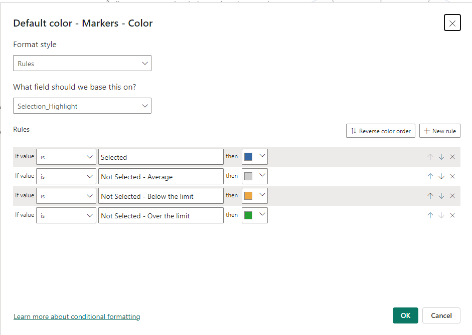
- Add the Measure: Create the
Selection_Highlightmeasure in your Power BI report. - Customize Data Colors: Go to the scatter chart visualization and set the data colours based on the
Selection_Highlightmeasure.- I shared screenshots of it here.
- Colour Rules: Define rules for colouring the markers:
- Selected: Specific colour for selected items.
- Not Selected – Below the limit: Another colour.
- Not Selected – Over the limit: A different colour.
- Not Selected – Average: A neutral colour.

And if you have followed along with all the blog posts then you should have something like this:

By using this advanced Power BI marker conditional formatting technique, you can significantly enhance the readability and interactivity of your reports.
This method leverages DAX to dynamically adjust the visual representation based on user interaction and data thresholds.
Make sure to check out the previous parts of this series for a comprehensive understanding of enhancing Power BI visuals. Stay tuned for more insights and advanced techniques in Power BI!
I learned some of the things discussed in this blog post from Power BI Bootcamp: Zero to Mastery course. If You join the course I will earn a commission.