Power BI Conditional Marker Sizing is popular for users looking to enhance their visuals. This approach uses inactive relationship tables and DAX, allowing for adjustments to visual elements as users interact with them.
This blog post builds on previous knowledge about disconnected tables, focusing on practical ways to adjust marker sizes for clearer visual communication.
Read part 1 and part 3 of this series.
I learned some of the things discussed in this blog post from Power BI Bootcamp: Zero to Mastery course. If You join the course I will earn a commission.
Understanding the Basics Power BI Conditional Marker Sizing

Before diving into the specifics, it’s crucial to understand the foundation laid by the previous blog post.
In essence, we are using a Power BI dataset with a disconnected table that makes it possible to visualize Markers with different colours. You can also use tables with an inactive relationship.
But now our users want even more customizations and to read the visuals quicker. The next option is to conditionally enhance marker sizing.
This is what we are doing in this blog post to add even further customization to the Power BI Scatter chart.
The DAX Measure to Achieve Power BI Conditional Marker Sizing
Here’s the actual DAX measure itself:
Marker Size =
VAR SelectedID = LOOKUPVALUE(
    'InstitutionDim2'[ID];
    'InstitutionDim2'[Institution name];
    SELECTEDVALUE('InstitutionDim2'[Institution name]; BLANK())
)
VAR IsSelectedPresent = CALCULATE(
    COUNTROWS('FactResults');
    USERELATIONSHIP('FactResults'[ID]; 'InstitutionDim2'[ID])
)
RETURN
    IF(
        ISBLANK(SelectedID);
        0,1;  // Default size when nothing is selected
        IF(
            IsSelectedPresent > 0;
            0,7;  // Larger size for selected
            0,1   // Normal size for others
        )
    )
The DAX Measure Explained Behind Power BI Conditional Marker Sizing

The DAX measure shared earlier provides a robust example of how to implement conditional logic within Power BI visuals. The formula uses several DAX functions to determine the size of markers in a scatter plot or similar chart based on user selections. Here’s a breakdown of the measure’s components:
LOOKUPVALUE: Retrieves relevant data based on user selection.- In combination with SELECTEDVALUE.
CALCULATEandCOUNTROWS: Assess whether the selected data is present in your results, guiding the visual representation.USERELATIONSHIP: Temporarily alters data relationships for the calculation, ensuring that the visual responds accurately to user inputs.
Practical Implementation of Power BI Conditional Marker Sizing
To apply this technique, you need to:
- Set up your data model with the necessary tables. Check the previous post already shared for the example data and how to set up the data model.
- Implement the provided DAX measure in your Power BI environment.
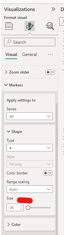
- Create a visualization (a Scatter plot – this solution won’t work on other visuals) and use the measure to dynamically adjust marker sizes based on user selections.
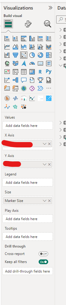
- Add the Measure to the Size Data values field!
Visualization Tips for Power BI Conditional Marker Sizing
- Conditional Formatting: Use the measure to conditionally format other aspects of your charts, such as colour and labels, enhancing the overall user experience.
- User Interaction: Integrate slicers that interact with the tables, providing users with intuitive controls for customizing visuals.
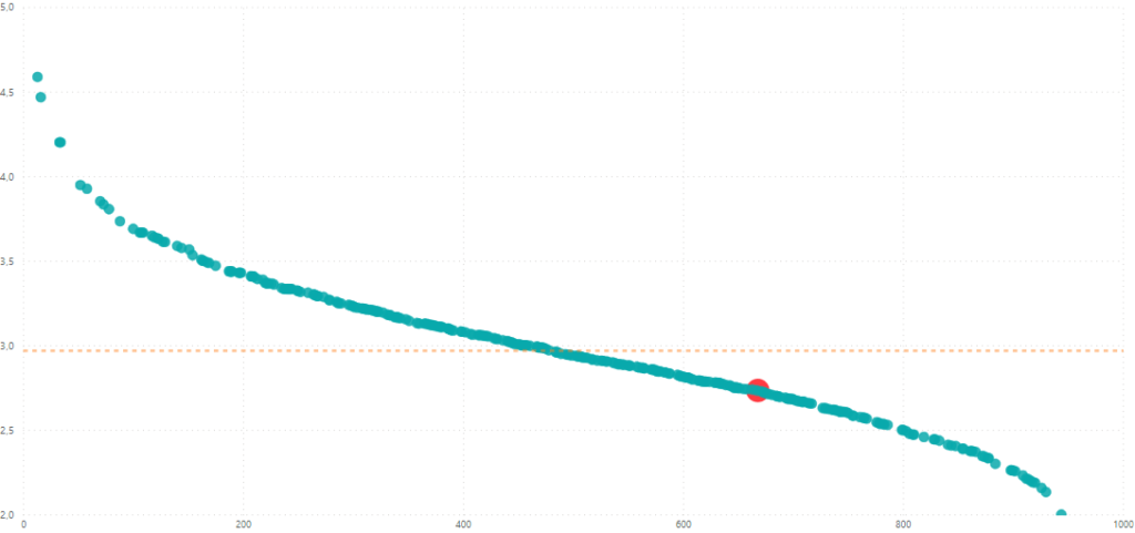
In the end, you should have something like this:
Conditional marker sizing using DAX in Power BI offers a nuanced approach to data visualization, enabling more interactive and user-responsive reports.
By following the steps outlined in this post, you can implement similar techniques in your projects, leading to more insightful and engaging data stories.
Feel free to experiment with the concepts discussed and share your results or questions in the comments below. If you’re looking to deepen your understanding of DAX and Power BI, consider exploring more advanced courses and resources.
Read part 1 and part 3 of this series.
I learned some of the things discussed in this blog post from Power BI Bootcamp: Zero to Mastery course. If You join the course I will earn a commission.