Power BI visuals with disconnected tables provide a simple yet powerful solution for enhancing dashboards without impacting the underlying data. This approach is perfect for when you need your visuals to remain interactive but not influence data aggregation.
In this post, I’ll walk you through a clear, step-by-step process on how to use disconnected tables effectively in your Power BI projects, ensuring your visualizations are both informative and engaging.
Read part 2 and part 3 of this series.
I learned some of the things discussed in this blog post from Power BI Bootcamp: Zero to Mastery course. If You join the course I will earn a commission.
Why Use Disconnected Tables in Power BI
Disconnected tables allow for interaction without influencing the data model directly. This can be useful in scenarios where user inputs should affect visuals but not data aggregation or calculations, providing flexibility in dashboard design and user interaction.
The Business Scenario of Using Power BI Visuals with Disconnected Tables

Imagine a large institution, perhaps in the public sector that has thousands if not tens of thousands of users.
All of these users have their own accounts and they log in to an application that is shared between multiple institutions.
Some of the visuals and data embedded with Power BI into these applications are accessible to all. Security groups and filters restrict some.
In this scenario, we have been tasked with the following:
- Show all of the data to all of the users who have logged in.
- Meaning, that people from sub-institution number 1 need to see the data from all the other institutions as well.
- Once the user has logged in, the institution they belong to has to change the colour of the visual.
- The main focus is still their data but they need to quickly see how they compare to other institutions.
Sounds simple enough? Good, let’s continue.
Follow Along with Using Power BI Visuals with Disconnected Tables
I have prepared Excel files for you to build a simplified dataset in Power BI to follow along and solve this puzzle with me.
You can download the files:
Read more about fact and dimension tables here.
Import these into your Power BI Desktop file and you should be good to go. NB! To copy-paste and use the DAX measures mentioned in this blog post, you need to change the names of the sheets imported from Excel as well.
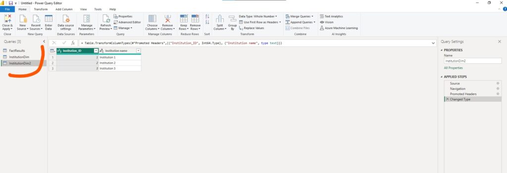
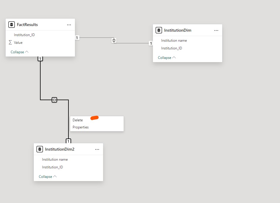
The most important part for this solution to work is the 2nd Dim table which is a copy of the InstitutionDim table. Just add a number 2 and you are done.
We are doing this to bypass the conflict that would otherwise arise using filters.
Disconnecting the Tables in the Power BI Data Model
In essence, we need to use one of the Dim tables on the visual – the main Dim table. And the second Dim table, InstitutionDim2 is the slicer or behind-the-scenes filter.
For that to work, let’s switch over to the Data modelling tab in Power BI Desktop and delete the connection between FactResults and InstitutionDim2 tables.
Creating the DAX measures to Use Power BI Visuals with Disconnected Tables
Now we are finally ready to create the DAX measures for our business scenario.
The first one is a simple SUM measure.
Total_Value = SUM(FactResults[Value])And now to create our desired colouring effect.
Selection_Highlight = IF(
    SELECTEDVALUE('InstitutionDim2'[Institution name]) IN VALUES(InstitutionDim[Institution name]),
    "Selected", "Not Selected"
)
Visualizing the Data in Power BI Desktop to Use Power BI Visuals with Disconnected Tables
It is finally time to visualize our data. Before that, we need to make a few tweaks to one of our measures. Screenshots below!
- First, add a normal slicer to the Power BI report page. Add the “Institution name” from InstitutionDim2 to the slicer.
- Add a Scatter chart to the report page.
- Add the “Institution name” from InstitutionDim to the X-axis.
- Insert the Total_Value measure to the Y-axis.
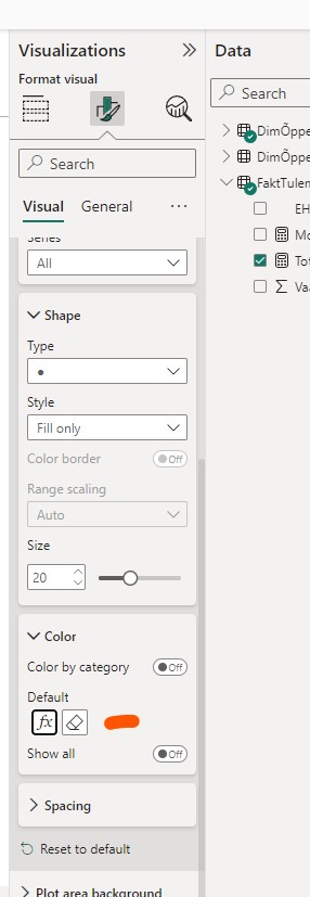
- While the visual is active click on the “Format your visual” paintbrush button.
- Click on Markers.
- Click on Color.
- Click on the fx button that is conditional formatting.
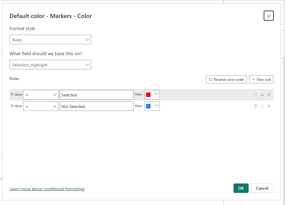
- On the conditional formatting page, choose Rules.
- In the “What field should we base this on?” choose the “Selection_Highlight” DAX measure.
- Create 2 rules.
- If the value is Selected then we want the color Red.
- If the value is Not Selected then we want something else or default.
- Click OK.
Here’s the conditional formatting menu after setup:
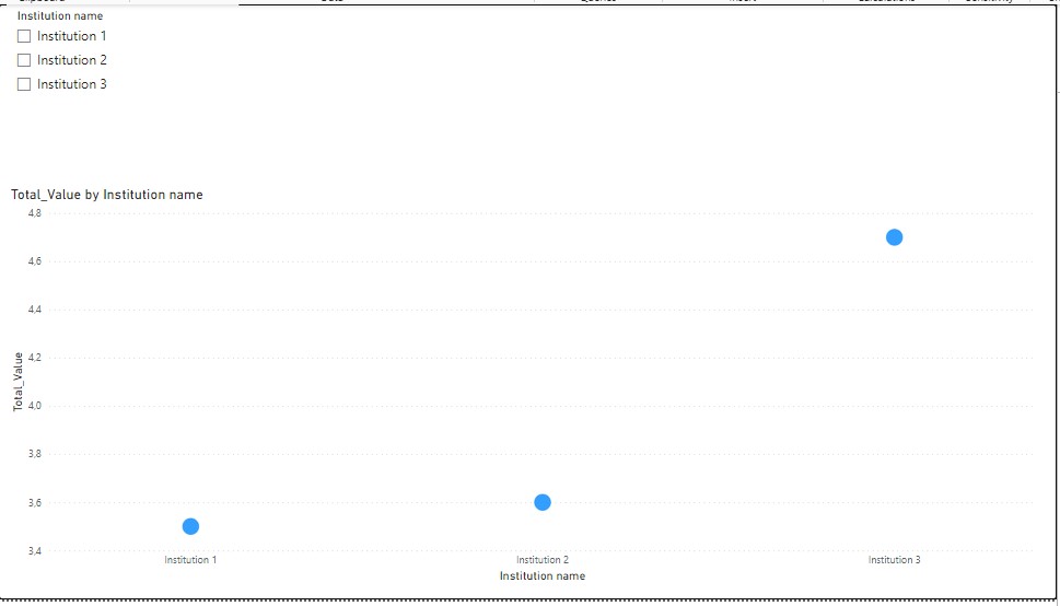
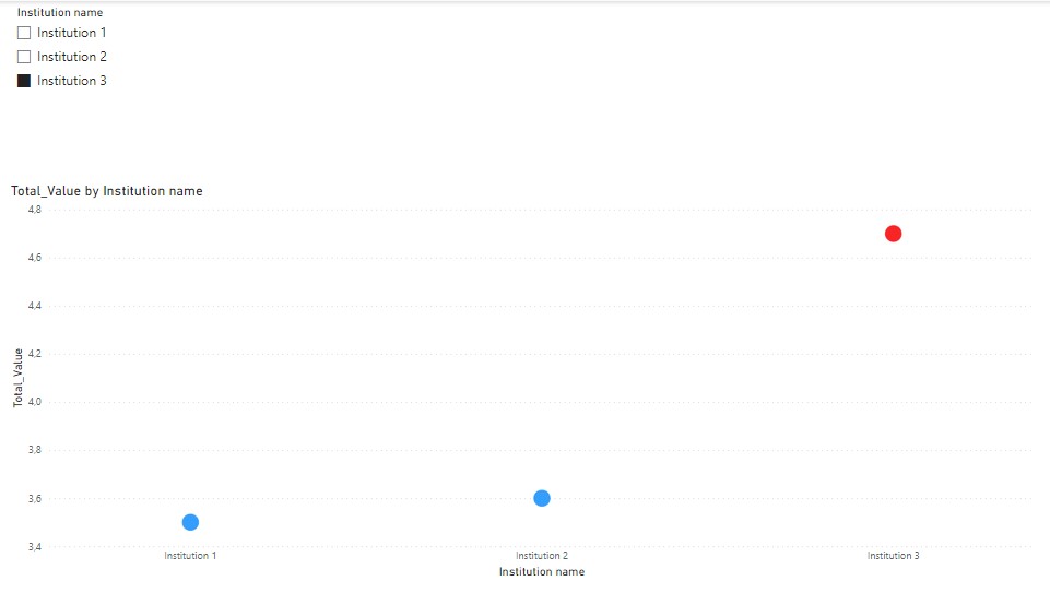
The Results of Using Power BI Visuals with Disconnected Tables
If you have done everything correctly you should at first have something like this without selecting anything from the slicer:
After selection:
Check out part 2 of this blog post here where I walk you through on how to change the marker size conditionally.
Feel free to share your experiences and questions in the comments below.
I learned some of the things discussed in this blog post from Power BI Bootcamp: Zero to Mastery course. If You join the course I will earn a commission.